I had been sitting with Julian Tuwim's verses for years. Half-finished translations, notebooks full of annotations, versions I abandoned because something didn't sound right. Tuwim wrote with a Polish musicality that seems impossible to carry over: internal rhymes, wordplay, rhythms that Polish children have been reciting from memory for decades almost without trying. How do you make that work in Spanish?
The method: read aloud, count on your fingers
My process had nothing digital about it. I printed, crossed out, rewrote by hand. I read each verse aloud, then again more slowly, counting the syllables on my fingers. If a finger was left hanging, the line didn't work. If I had to force a pause where there wasn't one, it didn't work either. The final test: could a child recite it without stumbling? Would they want to say it again?
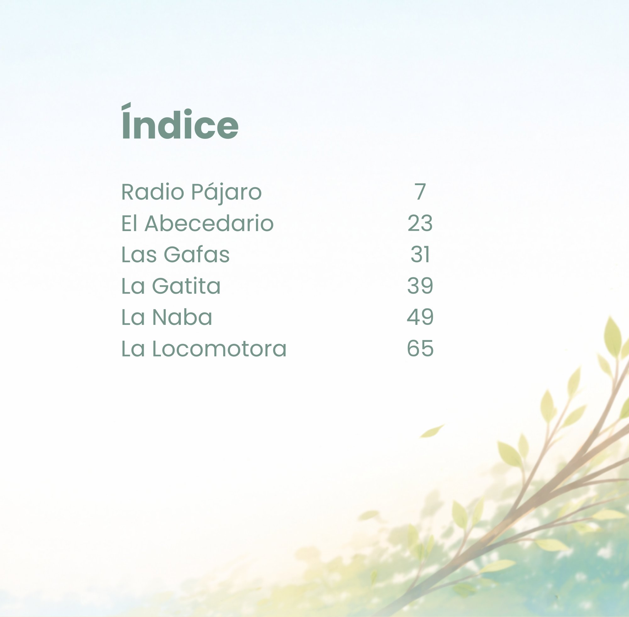
Some verses were resolved in an afternoon. Others took weeks. La Locomotora, for instance, has a rhythm that mimics the clatter of a train, and finding that same effect in Spanish without it sounding forced was one of the longest challenges in the book.
The critics at home
My children were the first readers. Not the kindest, but the most useful. If they lost interest before the verse was finished, the fault was mine. If they asked me to read it again, that was a good sign. My husband brought a different kind of reading: more analytical, more demanding about natural-sounding Spanish. "That word is too obscure for a child." "A Spanish speaker wouldn't say it like that." Comments that stung a little and helped a lot.
One of the most concrete examples was the verb coger — perfectly natural in Spain, but problematic across much of Latin America. The goal was to make a book that worked for all Spanish speakers, so coger became agarrar throughout. Every decision like that was a small negotiation between musicality, meaning and the book's reach.
The design: coherence without uniformity
The six poems in the book are very different from one another in tone and rhythm. The question was whether the design should reflect that difference or whether a common graphic thread should give unity to the whole. In the end I chose to create a coherent style within each poem — with its own colours, its own illustrations — while keeping shared elements so the book breathed as a whole.
In that process I consulted with Mateusz, a graphic designer friend, whose outside eye was invaluable. He was the one who pointed out that some of my colour choices worked individually but clashed with each other. There was also the page numbering problem: something that seems like a minor technical detail turned into a genuine headache when the numbers didn't align with the illustration layout.
The proof copy and the errors you don't see until you see them
I ordered a physical proof copy before publishing. Made more changes. Then another round of revisions. And even so, when the book was finally ready to go, I found a couple of capital letters that had slipped through. Early in the process I had decided that every verse would start with a capital letter — a visual choice. Then I changed my mind: I would follow linguistic correctness rather than aesthetics. That meant reviewing hundreds of lines, and two of them, at some point, went unnoticed.
They are small errors. They are also a reminder that no book is perfect, and that perfection is not the goal. The goal is for a child to hear these verses, repeat them, make them their own. For Tuwim's magic to cross the language and arrive intact.
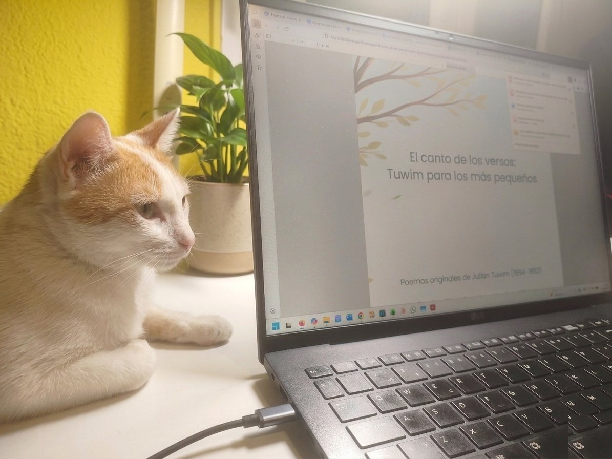
El canto de los versos Tuwim para los más pequeños is available on Amazon in paperback and hardcover. ↗ View on Amazon